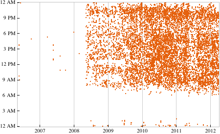
Last month, Stephen Wolfram did a blog post on the Personal Analytics of his life. For years, he’s recorded every phone call, keyboard stroke, email, and step. He made beautiful graphs to show his activity over the years. A Wolfram Alpha developer just posted a Mathematica notebook on the Wolfram blog allowing anyone to do the same email analysis that Wolfram did with any IMAP email account. Of course, I dropped what I was doing to try it out with my Gmail account. At first, it failed to finish processing my incoming email because the JVM ran out of memory. It took me a while to figure out how to tell JLink to let Java have more memory1. Here’s a plot of emails sent by from Gmail me over the last six years:

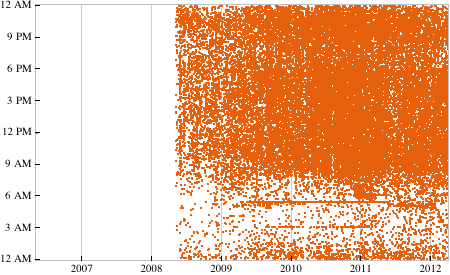
I started using Gmail regularly after I graduated from college in 2008 (once my college Exchange-based email account was gone). My emailing was noticeably sparse from May 2008-May 2009. During that time I was a teacher, and I didn’t spend nearly as much time on a computer as I do now. You can also see a gap during the summer of 2011. I was working at Kiva Systems at the time and primarily used my company email. On the horizontal axis, you notice I’m pretty silent between 11 PM and 7 AM. I need my sleep, and I never work at night! My emailing is light from 6-9 PM too. Here’s a graph of my email received over the past six years. It comes in pretty heavy from 8 AM to midnight!

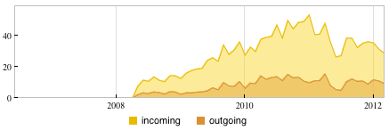
The thick line just under 6 AM is the Google Calendar email updates I used to get every morning. I stopped getting those once I got an iPod Touch this past Christmas. I can’t remember what email used to come at 3 AM for a few years. This next graphic shows the average number of emails I receive per day for each month. My amount of emailing ramped up once I started using email. Notice the downward trend on incoming emails recently: I’ve been unsubscribing from unnecessary mailing lists and circulars. My emailing had pretty serious peak last May right before I moved to Boston. Not sure why.

Here we have a histogram of the time at which I send emails. Apparently I’m most likely to send an email just after 10 PM. I wouldn’t have guess that. Don’t expect to hear from me after midnight!

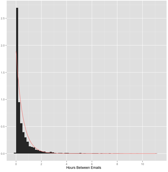
As a good operations researcher, I wondered if I received email according to a Poisson process. I pulled the email time stamp data into R. I get email pretty steadily between 8 AM and 10 PM. I looked at the emails that arrived in that interval since September 2011. The mean interarrival time is 0.53 hours. The standard deviation is 0.92. If it were a poisson process, interarrival times would be exponentially distributed, and the mean and standard deviation would be equal. Below is a histogram of the interarrival times of my emails. The red line is an exponential distribution with the rate set to 1 over the mean interarrival time of my emails. It’s not a terrible fit!2 One reason the email arrival rate might not be exponential is that I frequently have back-and-forth email conversations with people, which skews the distribution towards short interarrival times. I might do some more statistics later, but I have homework to do.
